Ptarmigan Peak No. 1 : Image 125
Images, Visualization, and Analysis
Click the corresponding arrow to select either a row or column of images for comparison in the Image Analysis Toolkit.
The photos in this image pair look southeast.
The photos in this image pair look southeast.


|

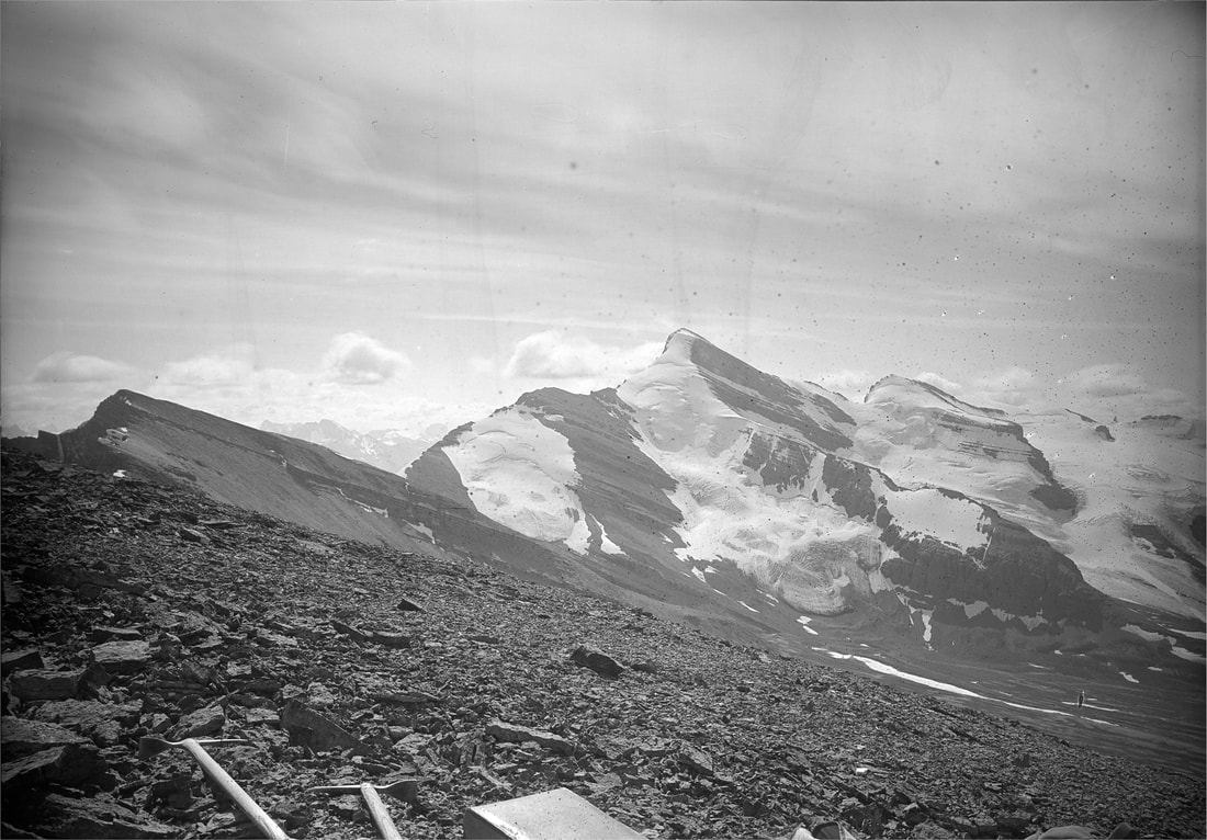
A.O. Wheeler, 1911, Image WH-125
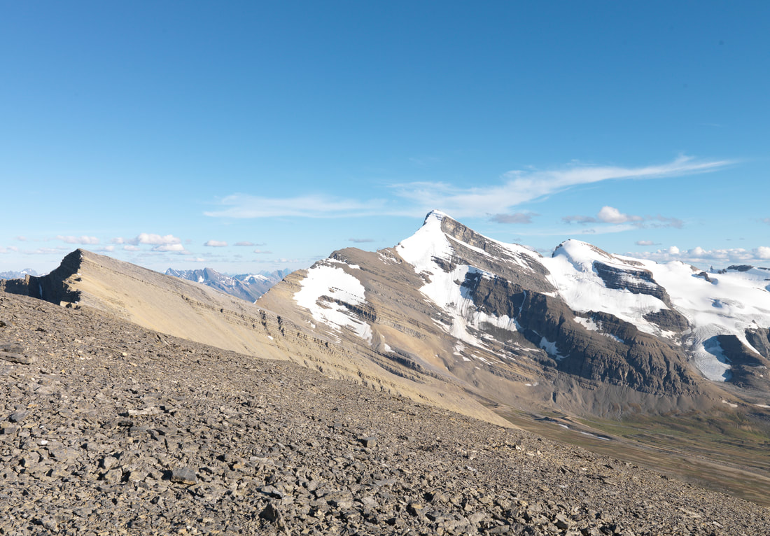
MLP, 2011, Image MLP-125
|
|

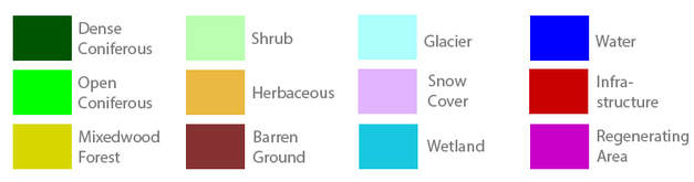
Category Key
Station Information
|
|
The historic images were taken in 1911 by A.O. Wheeler. The historic and modern image pair can be seen at Ptarmigan Peak No. 1, Image 125 The station has a number of other image pairs available for viewing. All of the images from this station are available at explore.mountainlegacy.ca The Google Map shows the location of the station, the direction of view for this image pair, and the general area covered. |
Analysis and Discussion
Analysis of Percentage per Category in 1911 Image WH-125 and 2011 Image MLP-125
|
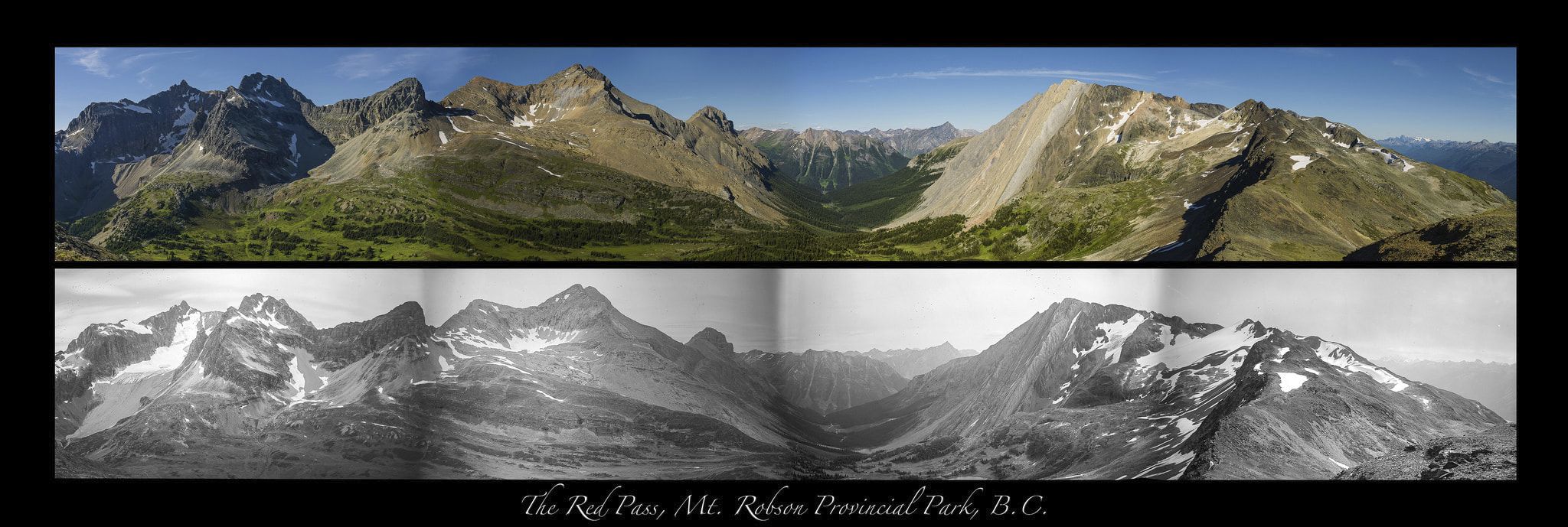
Figure 1: Panoramic view from Ptarmigan Peak #1: A.O. Wheeler, 1911
|
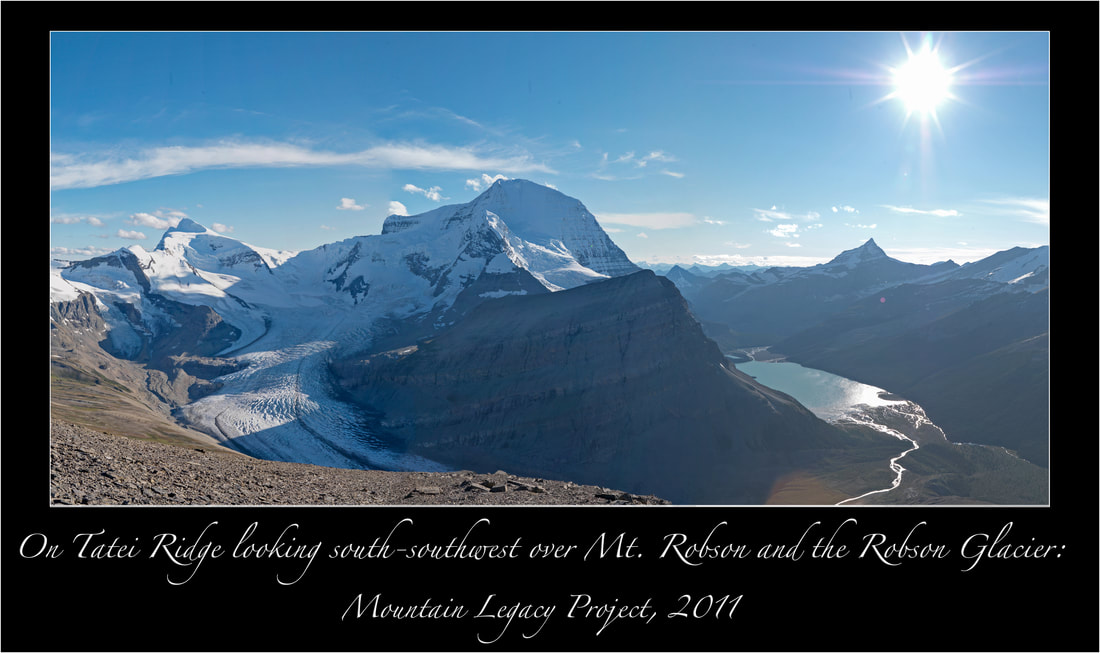
Figure 2: Panoramic view from Ptarmigan Peak #1: MLP, 2011
|
ac
As Figures 1 and 2 can attest - Ptarmigan Peak #1 Station gives an outstanding view of Mt. Robson, Berg Lake, and the extensive Robson Glacier curving around Rearguard Mountain. The images at this station are a fine representation of the classic alpine tundra environment found at high elevation in the Park.
The images selected here for analysis overlap slightly with the left side of the panoramas in Figure 1 and 2. WH-125 and MLP-125 add Lynx Mountain to the vistas of (L-R in the panos) Extinguisher Tower, Resplendent Mountain, Mt. Robson, Rearguard (in front), and Whitehorn Mountain in the distance. The significant difference that jumps out in all images from this area is the loss of glacial ice.
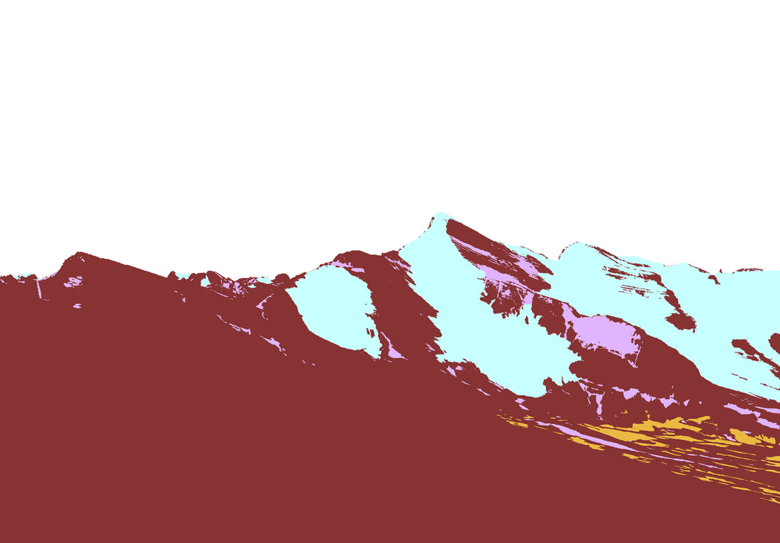
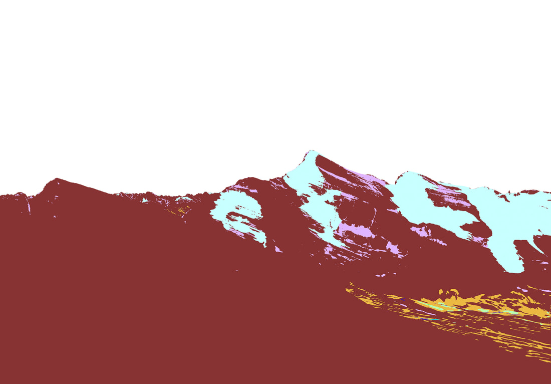
The 1911 image WH-125 shows the Glacier category covering 17.2% of the image. This has been reduced to 9.6% in the 2012 image (MLP-125). Figure 3, which shows all occurrences of the Glacial category across both photos, clearly identifies the loss. Figure 4 shows what the disappearing glacier turned into 100 years later. Not surprisingly Barren Ground accounts for the majority of change: approximately 6.4% of the 1911 Glacier category is Barren Ground in the 2012 image.
It is interesting to note two things about these classification masks represented in Figures 3 and 4:
Firstly, Figure 3 shows an area on the left horizon of the image as black. This means that haze, cloud, or some other non-classifiable feature obscured the area in the historic image. When this happens the occluded area is removed from both the historic and modern images when calculating the % remaining unchanged in each category between the images (intersection values).
Secondly, Figure 4 shows an area on the right horizon line that is black. This happens when an area of a given category - in this case Glacier - changes into something that is not categorized. In this case the black in Figure 4 represents the loss of glacial ice along the horizon. There was no category for it to change into, it melted away and changed the elevation of that portion of the horizon.
For this set of images a visualization looking at the Glacier category change from 2011 to 1911 is not really necessary - the glaciers in MLP-125 have not advanced. Although, there is a change of less than 1% to look out for -- probably where the left most glacier moved down slope and filled in the two small open areas visible in image WH-125.
As Figures 1 and 2 can attest - Ptarmigan Peak #1 Station gives an outstanding view of Mt. Robson, Berg Lake, and the extensive Robson Glacier curving around Rearguard Mountain. The images at this station are a fine representation of the classic alpine tundra environment found at high elevation in the Park.
The images selected here for analysis overlap slightly with the left side of the panoramas in Figure 1 and 2. WH-125 and MLP-125 add Lynx Mountain to the vistas of (L-R in the panos) Extinguisher Tower, Resplendent Mountain, Mt. Robson, Rearguard (in front), and Whitehorn Mountain in the distance. The significant difference that jumps out in all images from this area is the loss of glacial ice.
The 1911 image WH-125 shows the Glacier category covering 17.2% of the image. This has been reduced to 9.6% in the 2012 image (MLP-125). Figure 3, which shows all occurrences of the Glacial category across both photos, clearly identifies the loss. Figure 4 shows what the disappearing glacier turned into 100 years later. Not surprisingly Barren Ground accounts for the majority of change: approximately 6.4% of the 1911 Glacier category is Barren Ground in the 2012 image.
It is interesting to note two things about these classification masks represented in Figures 3 and 4:
Firstly, Figure 3 shows an area on the left horizon of the image as black. This means that haze, cloud, or some other non-classifiable feature obscured the area in the historic image. When this happens the occluded area is removed from both the historic and modern images when calculating the % remaining unchanged in each category between the images (intersection values).
Secondly, Figure 4 shows an area on the right horizon line that is black. This happens when an area of a given category - in this case Glacier - changes into something that is not categorized. In this case the black in Figure 4 represents the loss of glacial ice along the horizon. There was no category for it to change into, it melted away and changed the elevation of that portion of the horizon.
For this set of images a visualization looking at the Glacier category change from 2011 to 1911 is not really necessary - the glaciers in MLP-125 have not advanced. Although, there is a change of less than 1% to look out for -- probably where the left most glacier moved down slope and filled in the two small open areas visible in image WH-125.

Figure 3: Visualizing all occurrences of the Glacier category across both images.
This category covers 17.2% of the 1911 image and 9.6% of the 2011 image.
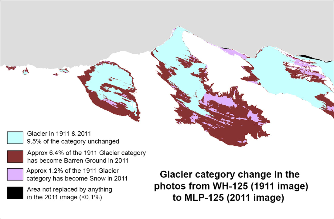
Figure 4: Glacier category change from the 1911 to 2011 photographs.
